Kitchen Remodeling
Cabinet upgrades, new layouts, countertops, backsplash, lighting, and complete kitchen transformations with a cleaner modern finish.
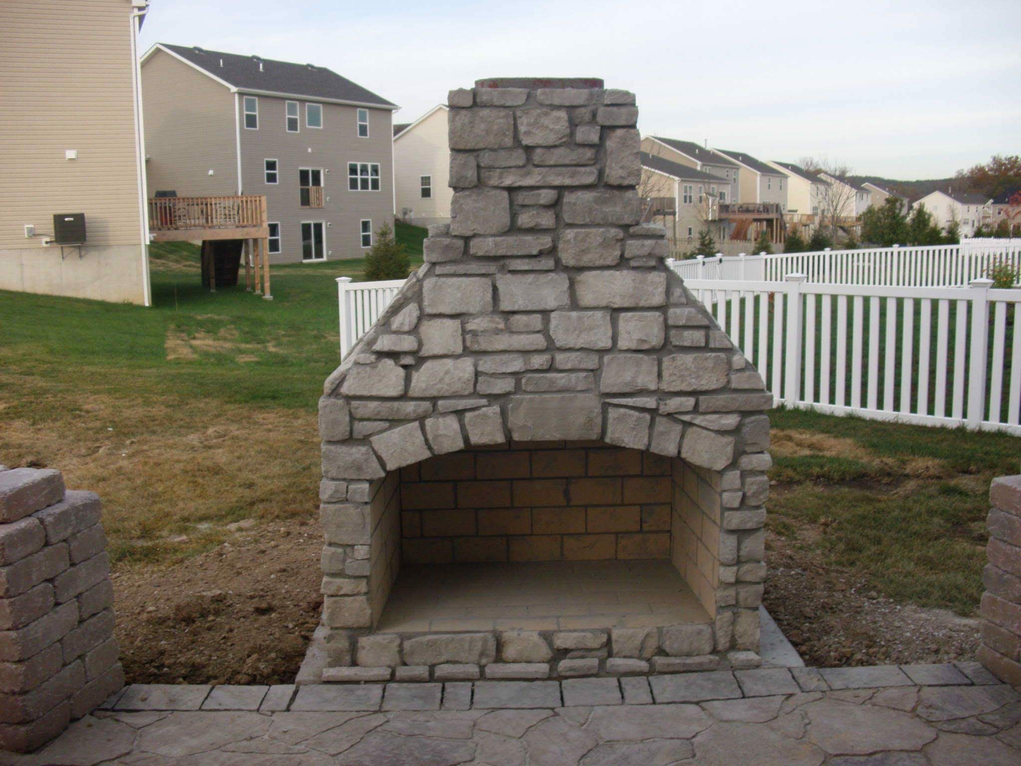
MO Home Pros brings together remodeling, exterior upgrades, and finish work with a polished look that feels high-end but still local, honest, and dependable. From kitchens and basements to decks, patios, tile, and painting, we help homeowners transform everyday spaces.
Cabinet upgrades, new layouts, countertops, backsplash, lighting, and complete kitchen transformations with a cleaner modern finish.
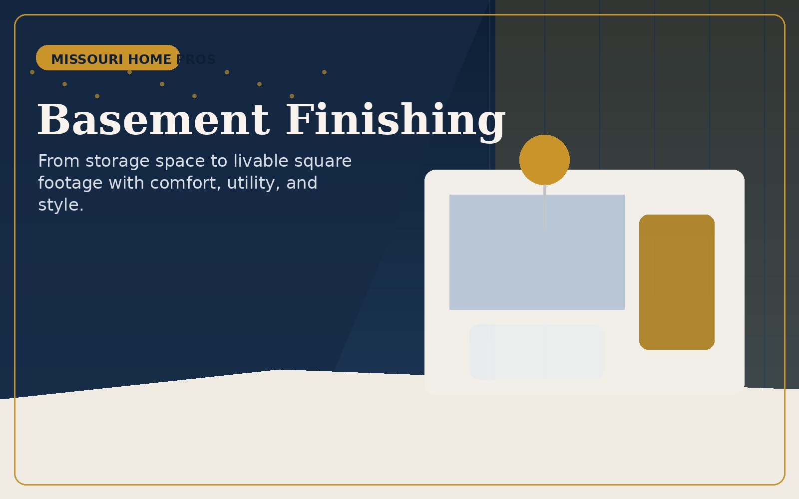
Turn lower-level square footage into living space, rec rooms, media rooms, home offices, guest zones, and multi-use family areas.

Updated showers, tile, vanities, flooring, trim, and better use of space for bathrooms that feel brighter and more refined.
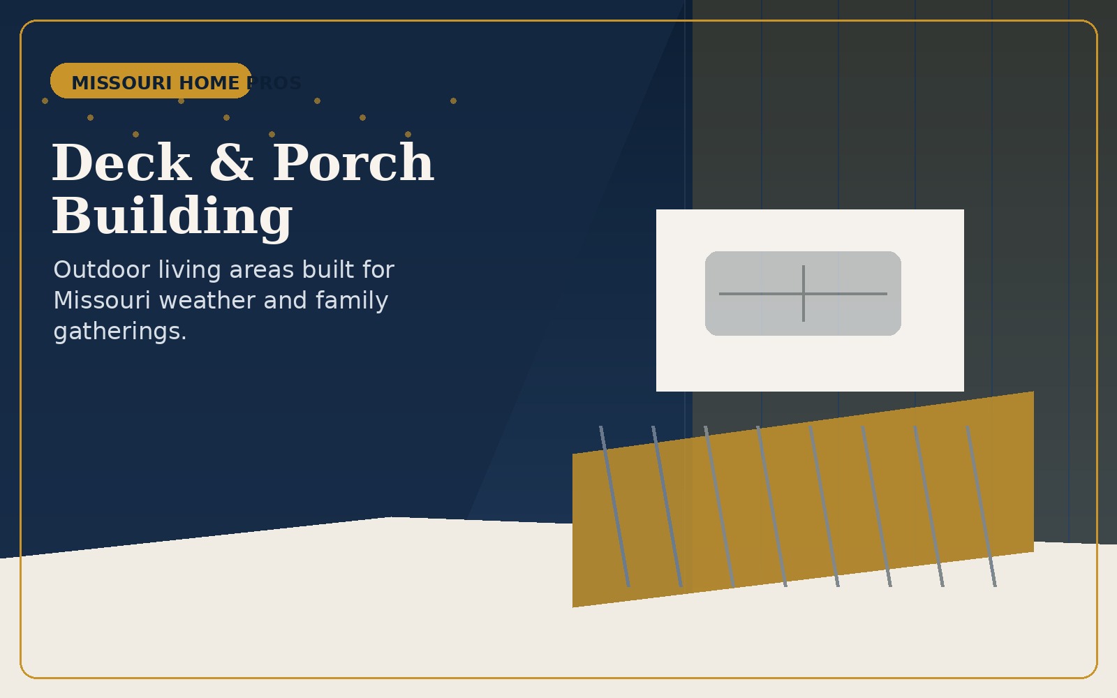
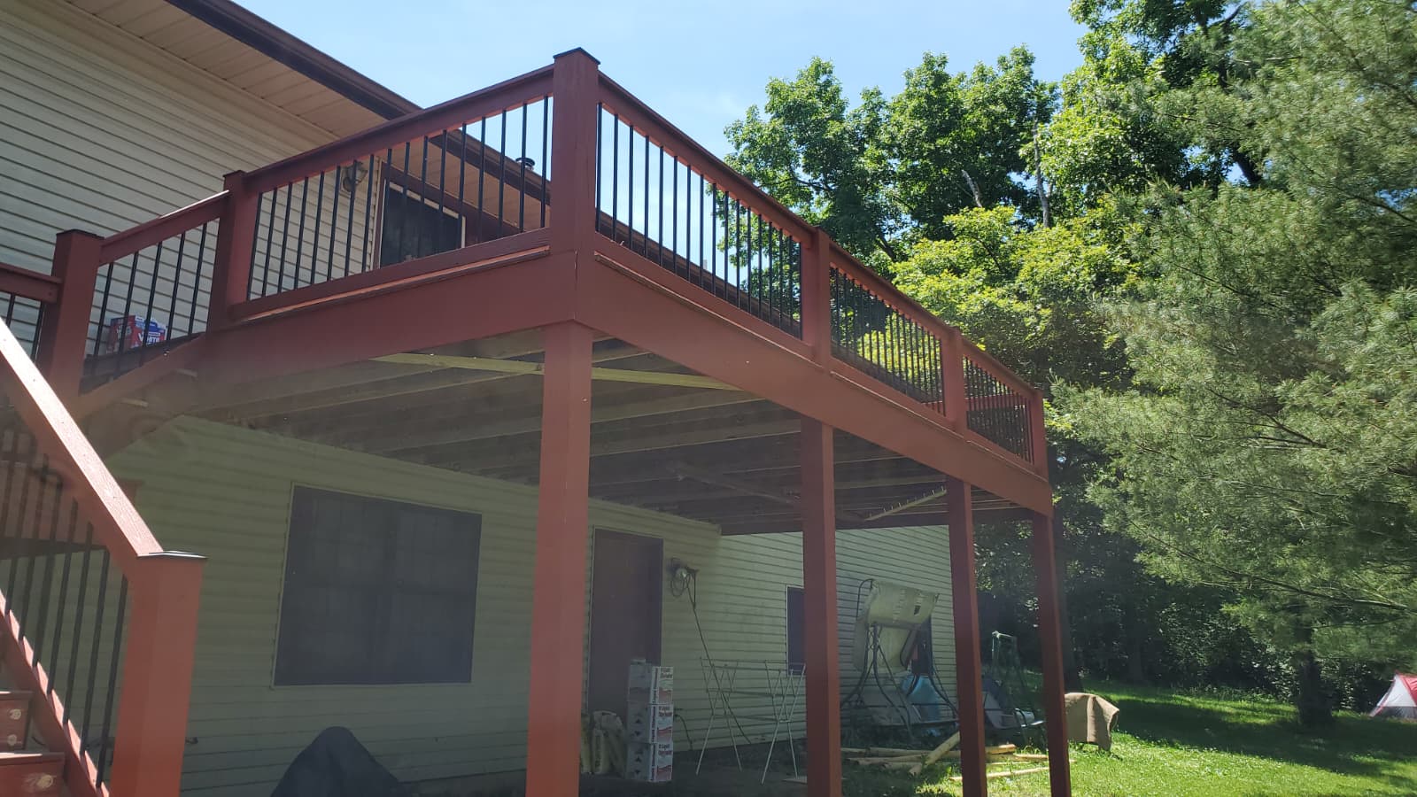
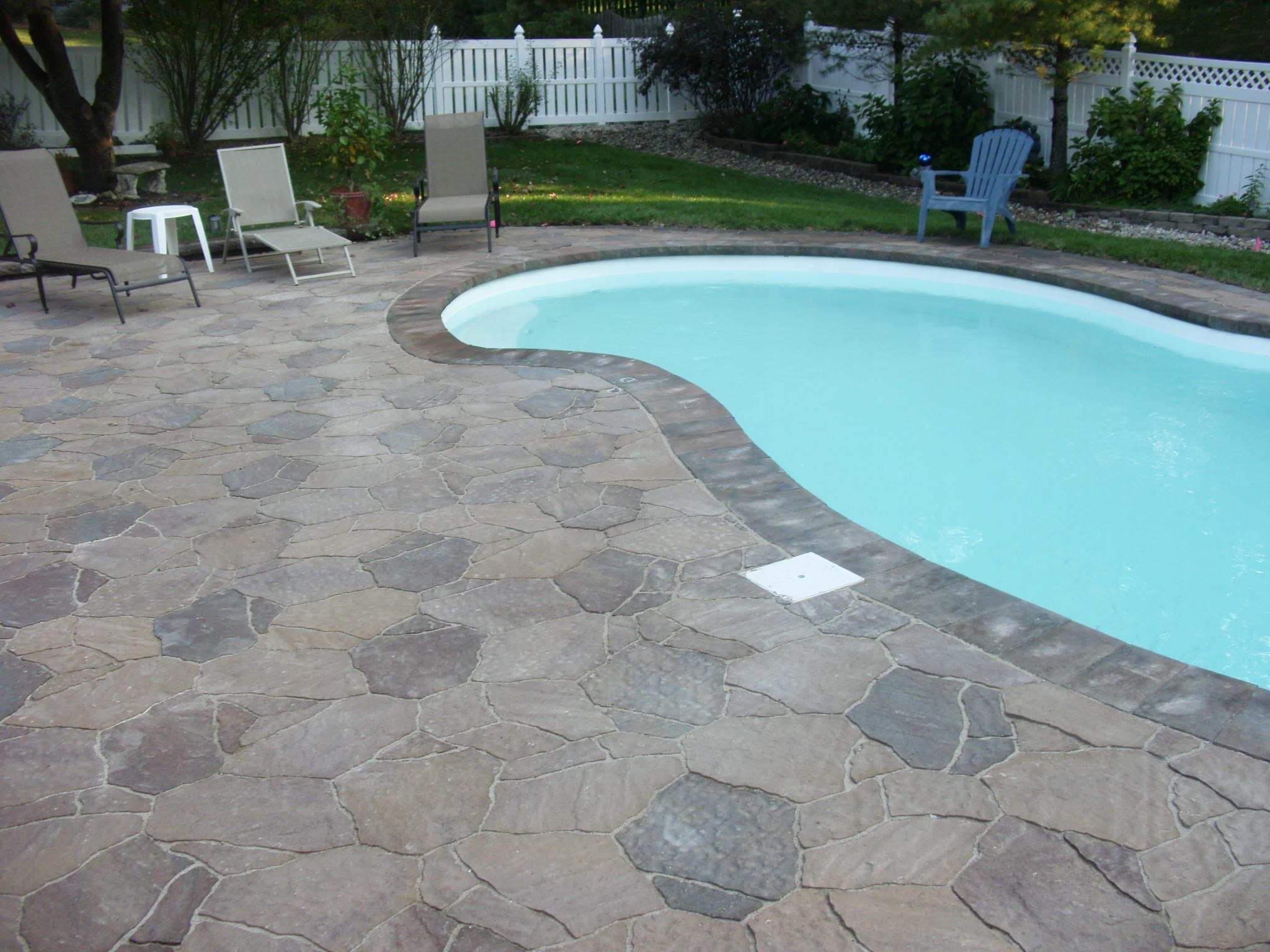
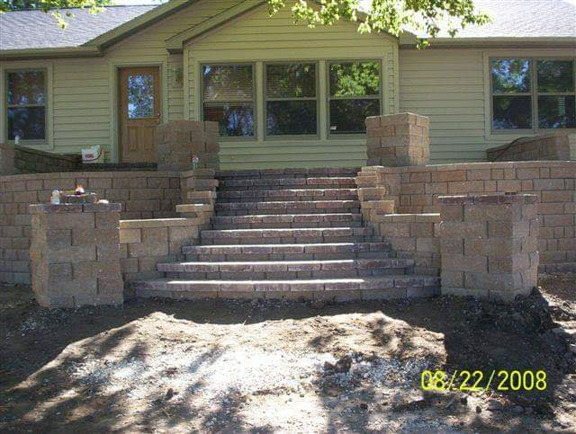
Deck builds, railings, outdoor upgrades, and backyard enhancements that extend your home into a more usable outdoor space.
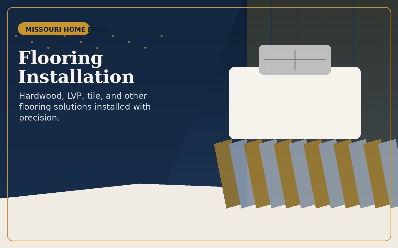
LVP, tile, hardwood, and more with the kind of install detail that helps everything else in the room feel elevated.
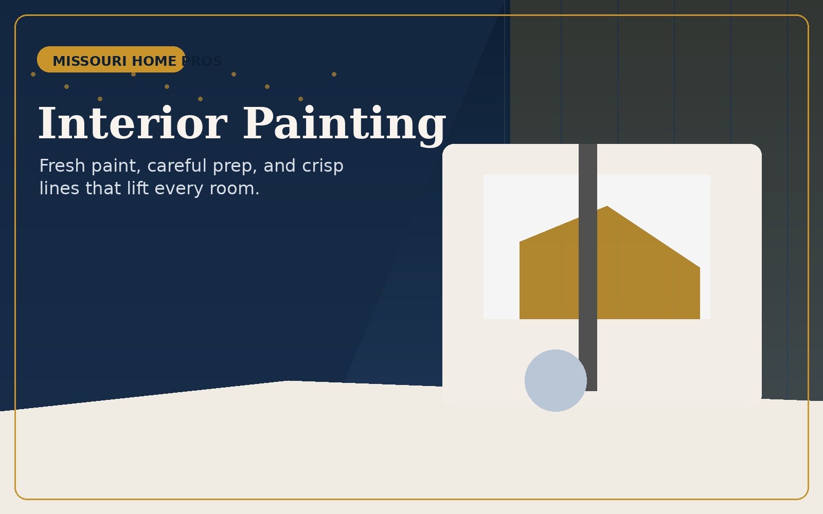
Fresh paint, repaired surfaces, trim refreshes, and interior finish work that makes a project feel fully complete.
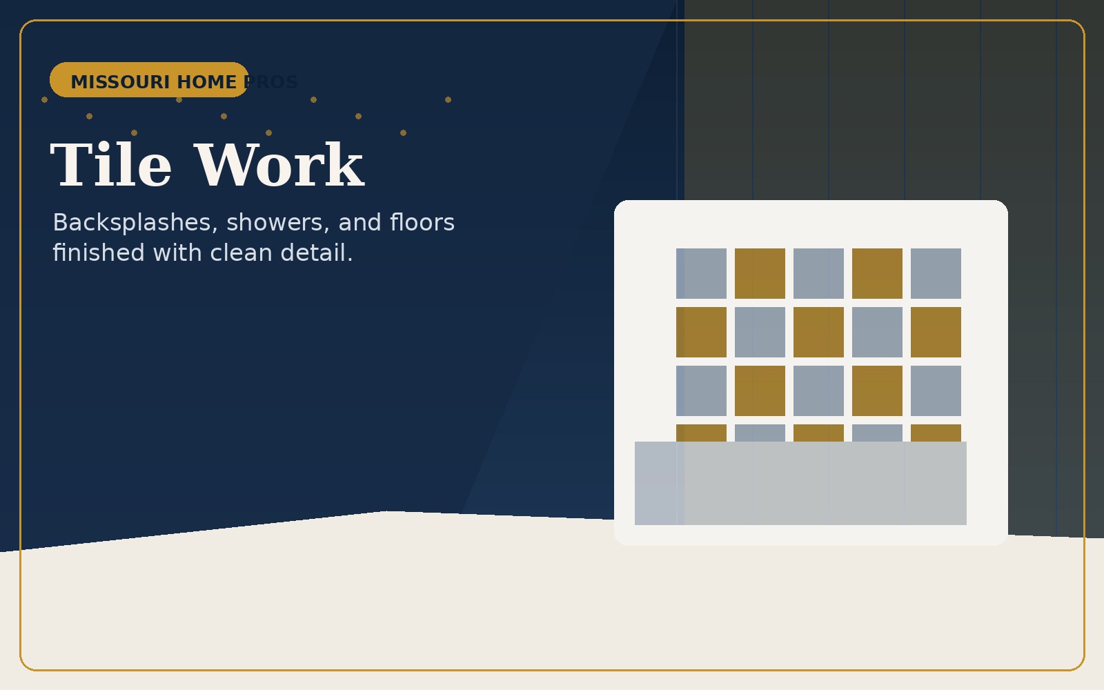
Showers, backsplashes, walls, and floor surfaces with strong pattern alignment and clean edge detail.
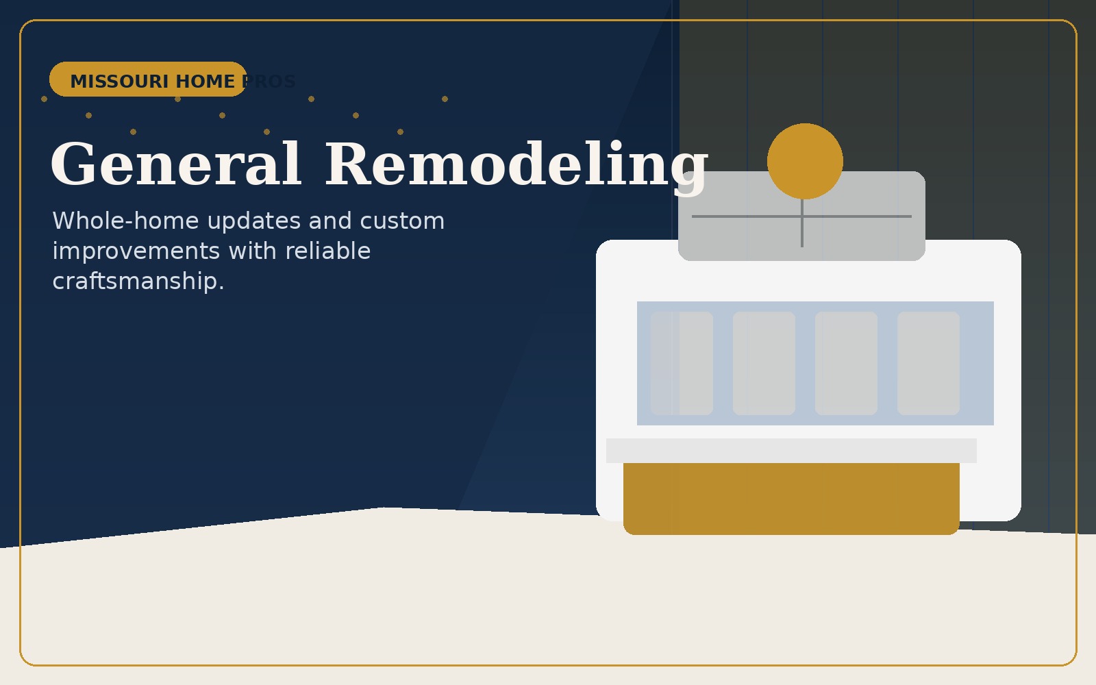
Custom updates, punch-list work, room refreshes, and the kind of all-around problem solving that homeowners keep coming back for.
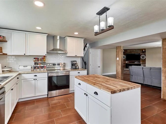
Brighter cabinetry, stronger flow, and a much cleaner finish direction create a centerpiece room homeowners notice immediately.
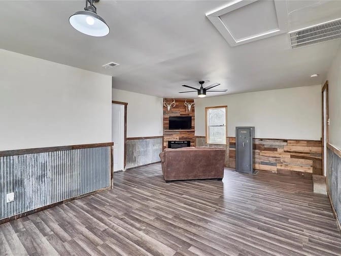
Lower-level square footage becomes a real extension of the home with better lighting, better surfaces, and better usability.
Covered outdoor spaces add function and make the home feel bigger without forcing the project indoors.